
- 15 minutes reading ( If short of time, you can bookmark it in browser / Facebook / Pinterest / Flipboard for later )
HEO Optimize Website to 5X Your Engagement & Conversion in 2023

- to
4659 Shares
The crux of the matter is, in this highly competitive IT world…you have to follow new standards to engage humans so that you can achieve your desired goals.
(click to navigate / right click to copy point link to share)
Table of Contents
You may be wondering why your website is not giving the desired results – engagement & conversion. Why your SEO isn’t working or failed to increase traffic?
If so, it brings up a more basic question:
Is your website capable enough to engage humans?
Websites are built for humans, not bots, so they are meant to be optimized for humans.
Content Qs
♦ How To Increase My Website Traffic Without SEO in 2023? (Michael E. Huff)
♦ Why Our Website Is Not Ranking In Google? (Marian F.)
♦ Why My SEO Isn’t Working Or Failed To Increase Organic Traffic? (Alfred)
♦ How To Optimize The Website For Higher Engagement & Conversions? (Jose Perkins)
♦ What Are the Best Content Strategies To Engage And Convert the Audiences? (Richard)
HEO is the new SEO!
Now you are probably wondering what are the parameters on which you can decide.
No worries!
Here you’ll find answers to your questions step by step. I will walk you through the elements of HEO optimization and how they can boost user experience functioning as a whole.
First, let’s look at the factors that will help you analyze your website’s ability to engage humans:
- 1st is Accessibility. All the stuff should be easily available.
- 2nd is Design. Good design can make everything good.
- 3rd is Content. Quality content will definitely leave a mark.
- 4th is Interactivity. Make sure users are influenced.
5th is Creativity. Oh! It has the power to connect seemingly unconnected.
Checkmark the above and make sure you are observing all the user standards.
Websites represent businesses and they are the hubs of all modern world business activities from digital marketing, and branding to lead generation.
If you want to establish your online credibility then, you must have a truly engaging website in 2021. That’s where many of today’s businesses’ online presence fail.
What was the last time you updated/optimized the primary pages of your website?
We call it:
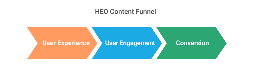
HEO (Human Engagement Optimization)
Maybe it’s a new concept relatively or buried somewhere in the world of SEO.
Forrester reports that 97% of websites fail at user experience.
Experience brings engagement and engagement leads to conversion, it’s that simple.
So, now it’s up to you if you want to be included in the 3% who succeeded, then get ready to go the extra mile.
As if that’s not enough,
Simply put…
- Is your site more integrated with your brand & business?
- Is it interactive(interface) and easy to use (Usability)?
- Is it eye-catching (design and visual story)?
- How to present the solutions offered by the website? (useful content)
Before moving to the section in which you’ll be guided step by step on how to HEO Optimize your website.
First, let me explain
Why Should You HEO Optimize Your Website?
Look, which thing mainly boosts a website?
Is there some Abracadabra involved or something else? What is it?
It’s users’ traffic. Yes! We humans boost up any website’s business. The human aspect is becoming more important with every new algorithm update.
You might already know that Google’s RankBrain is the third most influential factor in ranking. It focuses on the user’s behavioral criteria like how long one reads the content etc. And then in the end they generate reports and let browsers know your website’s worth.
Now, another query raises her head.
And, which websites have users’ traffic?
The simple and straight answer to this query is those who have the ability to engage humans.
Yes!
But wait! Is this an easy task?
Engaging Humans! The Less Attentive Specie:
Engaging humans is no more an easy task and to prove that, Canadian researchers surveyed 2,000 participants and studied 112 brains.
He declared that humans have less attention span than Goldfish. An ill-focused goldfish can focus for 9 seconds, and humans generally start losing interest after 8 seconds.
Now how will we engage these ill-focused species in our hard-created web pages?
Through on-page HEO assets! Copy, Graphics, and Visual Story.
Responsibility At Company’s End:
Many businesses are shifting online. Competition is getting tough day by day. According to Datanyze, a 48% rise was seen in new paying subscribers from Feb to Apr.
Heidi Gibson, the senior director at GoDaddy, said, “There’s a huge entrepreneurial spirit happening right now.” The same goes for users’ choices and standards.
But, it has been seen that companies show a non-serious attitude toward their websites. They do not bother to update their websites for the needs of 2021.
As the IT world is going through changes every single day. So if one is leaving his/her website like the one which was built several years ago. Then, one should never mind joining that 97% who failed at the user’s experience.
HEO Provides:
HEO optimization mainly focuses on turning your websites into a new era by tuning up UI, UX, Content, and SEO.
It is the era of success in which your website will be able to provide the best user experience.
As it is a matter of fact that improvement in user experience can raise:
- Your brand sentiment.
- Enhance customer loyalty.
- Generate regular visitors.
So now I hope that you’ll be all clear…all set to implement HEO on your website.
Now, comes the elements of HEO optimization:
HOW TO HEO OPTIMIZE YOUR WEBSITE
There are many primary and secondary elements that help in optimizing your website to engage humans.
So just gear up yourself to implement the following steps if you want your online business to boom.
First Step: Build User Persona
Very first step where we start losing business.
A user persona is a model that is based on your current or ideal customers. It can help in achieving your goals by knowing what your users actually want.
Users play a pivotal role in this game. And, understanding the needs of the target audience is a must.
Things are made on the basis of requirements. Right?
So first know your audience, gather their requirements, and then design your website according to their needs.
You can easily find which type of people visit your website by Google Analytics. To understand your audience, simply ask these questions suggested by Fit Small Business:
- What devices do they use mostly to access business websites?
- How do they like to interact with businesses? By email, live chat, or phone?
- How quickly do they expect a response to their questions?
- What design styles do they most appreciate?
- What design colors most appeal to them?
After receiving answers to these questions, update your website to meet all the users’ standards.
Second Step: Clear & Intuitive Informational Structure
Leonardo da Vinci:
“Simplicity is the ultimate sophistication.”
You see things definitely get smooth and easy to handle when they are simple. And, same will be the case with your website.
If you simplify your design and layout users will get attracted. It’s that simple. And, all you need is the user’s attention through interaction.
That’s it.
The easier you can make the process, the more appreciative the end-user will be and the more likely they’ll come back.
If you don’t find what you want, you get frustrated. Right?
So mind that if the user gets frustrated they will never visit again. 76% of consumers say that the most important element of web design is being able to find information.
Here’s the deal:
- In global navigation, add the lower level page under the branches.
- Review the information architecture with a sitemap. Lesser the amount of clicks to find information higher the chances to receive an overwhelming response.
- Group out related content.
- Highlight important pages.
Checkmark the above.
Third Step: Smooth Navigation
Navigation tells us which way to go. 94% of consumers say:
Websites must be easy to navigate.
So, in this regard just follow these simple steps:
- Label your services and products in a way that makes sense to user personas.
- Make your most valuable lead-generating content visible (not buried too deep).
- Offer important content in different places.
- Be cognizant of the no. of clicks required to opt for certain information. Lesser the number, the greater the user experience.
- Add utility navigation. It consists of secondary actions and tools such as contact, subscribes, and blog.
- Put utilities where people expect and need them-typically above the global navigation and in the footer.
Done. Fine & dandy.
So, hold on and here we have the primary element of HEO.
Fourth Step: Visual Optimization
Now, you’ll be thinking why is visual optimization important?
The simple answer is large and not perfectly edited images can make your website slow.
You know what? Users hate to wait. And similarly, they won’t wait for loading and click back as soon as they start getting frustrated.
This optimization helps in many ways:
- Page loading speed would be fast.
- Websites will rank higher on search results.
- Smaller images use less bandwidth and require small storage
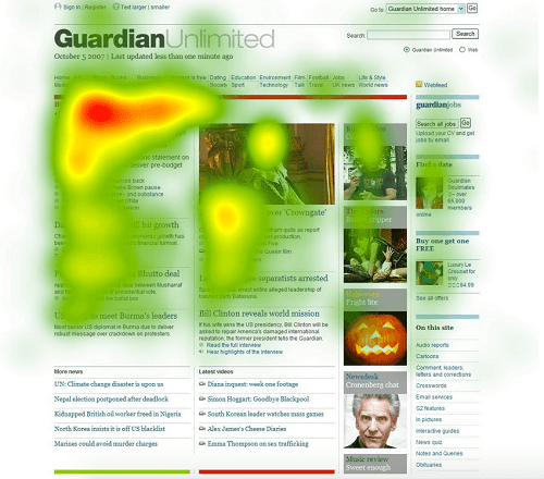
You see, it’s no secret that users only read 20% of the text. As the eye tends to gaze on graphics more than text. Then, why not incorporate more graphical elements?
Just follow these simple steps to visually optimize your website:
- Give a proper title.
- Add Alt tags to your images.
- Reduce the size of images.
Let’s move ahead and see how many ways you can visually optimize your website.
1. Good Page Design:
Web pages as a whole create a website just like a book containing many pages.
Have you read any books? Which one is your favorite?
Ok! Tell me one more thing, you visit someone’s house.
The outside view of the house is great but when you enter the rooms. They are in terrible condition.
What will you feel?
Awful. Right?
Similarly, if you create outlook good and subcategory pages bad. Users will feel awful and would never want to visit. You might have heard, “The first impression is the last expression.”
Just,
- Use creative ways to design web pages.
- Focus on every single page.
- Follow the consistency.
For example, if you are publishing blog posts, make sure the posts should always be in the same place with the same design elements throughout the site.
When the user visits your website, you only have a few seconds to make him/her stay. Otherwise, 8 seconds would be more than enough to distract him/her.
So, I believe you are done with designing beautiful web pages.
Now, let’s talk about the color scheme.
“Crafting a combination of enticing graphics and compelling copy that converts.”
2. Select Perfect Color Scheme:
Colors have a huge impact on visitors. The wrong choice of color can leave devastating results. With colors, you can influence users’ perceptions and actions on your website.
Colors have meaning. Yes! I’m right.
You know everything has meaning… if something has no meaning, it’s useless.
Most experts suggest going for a Blue or Green color. As they are safe to play with.
But, you can definitely play with different colors. Just make sure you have the knowledge of colors. Understand the psychology behind them.
Like,
- RED – representative of speed, energy, and passion.
- ORANGE – represents optimism and happiness.
- YELLOW – shows positivity, happiness, and warmth.
- GREEN – shows calmness, and conveys eco-friendliness and sustainability.
- BLUE – shown to inspire feelings of trust.
- PURPLE – represents wisdom, creativity, and confidence.
- BROWN – representative of down-to-earth nature. Shows honesty.
- BLACK – shows modernity.
So, these were some mostly used colors on the website. Just use them wisely.
3. Graphical Optimization:
You know what? Ideal and perfectly designed graphics can give a huge boost to your website. The effective use of graphics can immediately grab the user’s attention.
This would be the best way to communicate with your audience.

4. Storytelling and High-Quality Imagery:
Your imagery should have the ability to convey what your business is about and how you serve them. Add meaningful and impactful images on your home page and other pages as well.
5. Add Graphic Icons:
People love Graphical User Interfaces. Icons help give users a point of reference. Graphics attracts a lot. Web usability studies have pointed to higher bounce rates when visitors face too much text, especially when making drill-down choices.
6. Make CTAs Visually Engaging & Actionable:
Websites have a prompt that Calls to Action, like “Order Now”, “Sign Up”, and “Sign In”, etc.
CTA should be designed in such a way that users can’t help but click on it and perform a certain operation.
The higher the appealing design of CTAs will be higher the chances to obtain your goal would be.
In this regard, Graphical Buttons can help. As they are an effective way to direct the
User’s eye toward the next step. Buttons that are bold, well-designed, and incorporate action-oriented verbiage are more likely to convert your users.
You can take the example of an e-commerce site. They witnessed a 35% increase in conversion when they redesigned CTA using bolder colors.
There are many online tools available that can create unique graphic buttons like Canva etc. for you.
What you have to do is. Just;
- Check how the competitors are doing
- Find the ideal color for your CTAs.
- Conduct research.
- A/B testing.
- Use the results to optimize your website UX.
Yeah! It’s that simple.
Ok! Moving on…tell me have you heard the words of Walt Disney that,
“Animations can explain whatever the mind of man can conceive.”
So, why not just let’s move to adding some animations to your website?
7. Use Purpose-Driven Animations:
Since web design is now vastly improving, animations can play a great role in conversion. You can also distract the user when your content is loading.
Purpose-driven animation can make the user’s experience better. With the help of animations, you can make the user attentive to content.
Use animations with purpose, such as to:
- Encourage scrolling.
- Assist with navigation.
- Prompt conversions.
- Entertain users during page loads.
• Signal process or a completed action.
Here are some tricks and tips as well which will help you add glamor to your animations:
- Use CSS for creating animations.
- Use responsive animations.
- Add animations in the UI elements.
Animations are a great thing to use. But, there are some loopholes as well. You just have to make sure that,
- They are not creating a negative impact on usability.
- They are not non-responsive.
Besides animations, you might have heard about sliders.
Let’s have a look at them as well.
8. Use Sliders Wisely:
Sliders are hugely popular with many modern websites these days. It refers to a slideshow within the website. They’re becoming a trend. They provide you with an opportunity to pack lots of information.
There are differences of opinion in regard to using sliders on websites. Some cannot imagine a website without them and others never like to use them. Some love them; some hate them.
So, the thumb rule is to use them wisely. If you can properly manage to add them and it suits your website then go with them.
9. Proper use of white spaces:
White spaces can help make the information easier to digest. It’s that simple.
You might have heard silence in the music. It is a must and white spaces are just like that. They create harmony and balance.
Dropbox is a big example of it. They have used whitespace in a big way.
So if you want to create a flow, properly use them and users will love it.
Now, here is the Good news!
If you have followed the above steps wisely and accurately, you are done with designing a great website….Hurrah!!!
Now, comes the king of web – content that you will publish on your HEO-optimized website. As content is like the heart of any site.
Fifth Step: Copy - Interactive & Engaging Content
Content portrays your website to search engines. So, be conscious about the content you publish on your website. It is how new people will find you through searches.
Using interactive content will drive engagement.
Quality content helps to attract the right audience. According to a 2016 survey by Content Marketing Institute, 75% of marketers plan to increase their use of interactive content.
Good content can help you stand out from the masses. So, when publishing content makes sure the content is:
- Unique.
- Attractive.
- Easy to read.
- Informational.
- Well-structured.
- Well-written.
When you publish such content, you’ll receive good reviews.
Displaying social proof on your site is a great idea.
Sixth Step: Highlight Social Proof Wisely
Social proof is a psychological phenomenon where people look to the behavior of others to determine the correct course of action.
Users love to view reviews about what they are opting for. So, always add positive reviews about your business on your site.
Placing a positive customer review on your site will demonstrate your trustworthiness to prospects. And, people will get influenced. As 79% of customers trust online reviews.
So, it would be a great idea to display the best reviews besides the best samples on your site.
So, here the end comes…
I have tried to highlight the importance of an HEO-optimized website. So, that you can adopt and increase your conversion.
Besides that, I have shared all the nitty-gritty details of how you can optimize it. By using user persona to highlight social proofs. Everything was jotted under the same umbrella just for your conveyance.
So, the crux of the matter is, in this highly competitive IT world…you have to follow new standards to engage humans so that you can achieve your desired goals.
The need of the hour is just to gear yourself up and get ready to go the extra mile to make your website visually engaging and appealing.
If you have any questions, comments, feedback, or tips I missed, we’d love to hear it below!
FAQs
When you upload a smaller image size than 564 and if the image is not in an exact square shape, Pinterest crop and stretch the cover. (So always upload a square image with at least a size of 564px square.
With a new update, Pinterest compresses all the media as we upload so it looks fuzzy. It is their system so you cannot do anything. Remember, you must not compress (pre-optimized) your images (board & Pin) before uploading.
Either Png or Jpeg. Most of the time we use the Png image as it works well with the copy (text overlay).
Sometimes you notice that your board cover is not fitting properly on all devices, it is only because of not uploading and selecting the proper sized and dimensioned image set as cover. You may need to try more than once to select a cover from board options and then confirm from your profile that the board cover is updated.

Z.D. Babar
Connect @ LinkedIn
A fine copywriter, SEO/HEO expert, content strategist and digital marketing guru. Co-founder & CEO @ Qontentify. Helps content marketers in optimizing their content & social pages with SEO plus HEO, to convert the highest. Chief growth strategist @ MarginBusiness – Amazon agency.
- to
4659 Shares
*Disclosure: It may contain affiliate links that may earn an advertising fee for advertising & linking to the merchant / business.

Join world's Largest HEO community!
Multiply Your Leads & Sales – Master HEO with Us!
- Get weekly actionable HEO tips to boost engagement
- Access a FREE HEO checklist to optimize your website
- Exclusive early access to our HEO research & insights
- Chance to win FREE website analysis in our weekly live sessions!